We’re taking a look at the biggest and most exciting website design trends of 2020 and the last few years. These trends could be set to take over and dominate website design in the UK in the years to come.
Throughout 2019 we have seen more website designs take an experimental approach – opting for bold creativity, eye-catching designs, and artistic influences. It’s all about stylishly and creatively grabbing the attention of your audience, with website top-folds that wouldn’t look out of place at an art exhibition.
High-end websites and big companies pave the way in terms of trends within website design, and we expect these latest trends to trickle down and also become popular across small business websites within the coming years.
Website design trends from 2019 that are here to stay in 2020.
Some trends from 2019 and previous years are still gaining traction and popularity across the internet. These websites trends will likely be seen popping up on small business, freelance, and start-up websites over the coming years.
1. Hero videos
A hero image is a huge image that covers the full width of a website page and dominates your attention, these are incredibly popular and you don’t need to look far on the web to find countless examples.
A hero video is the same thing but with video. These full-screen videos cover the top-fold of a website’s home page or landing pages, to capture attention.
Video is becoming more accessible to businesses of all sizes, and as businesses invest more in videos we are likely to see this trend continue.
It’s just a little bit difficult to demonstrate what we mean on this page, but if you click on the links below you will see some great examples of hero videos in website design.
https://www.tntrainingservices.com/workplace-coaching-uk
https://www.lamborghini.com/en-en/models/huracan/huracan-evo
https://www.valvesoftware.com/en/
https://uk.dollarshaveclub.com/
2. Gradients, gradients, gradients
The colourful retro or futuristic feeling gradients have dominated website design, and well, all design, for a number of years now and currently, this trend hasn’t yet slowed down.
There’s something very visually pleasing about a nice colour gradient, and the hues you choose can reflect a different feeling or vibe for your website.
We may now start to see some different coloured gradients, perhaps some more muted and pastel hues intertwined with other popular website design trends.
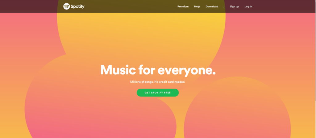
3. Fluid organic shapes
Rounded, fluid and organic shapes have become more common within website design. They almost remind me of a droplet of water spilt on a coffee table, and in a very organic and natural way, they can create a feeling of fluidity in design.
The Spotify example above shows this type of shape used prominently in the design, but this can also be used quite subtly, to create a feeling of motion within a design.
No, I’m not gaining weight. I’m just becoming a fluid organic shape. Trust me, it’s in.
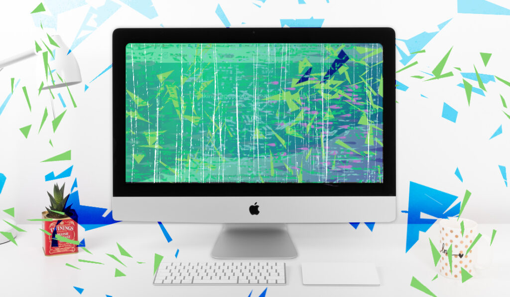
4. Abstract illustration
Fun, playful, creative, and eye-catching: If a picture can say a thousand words then an abstract illustration can say a thousand words beautifully.
You tell a story, sell a mood or a vibe, and demonstrate your product. An abstract illustration can create websites that are both stunning and commercially successful.
This trend has been growing in popularity over the last few years and isn’t just prominent within website design, but design as a whole. These illustrations are making website design more artistic, putting visual appeal as a priority.
Emerging website design trends in 2020.
Whilst these trends don’t yet dominate the web, you’re likely to see them gain traction and popularity over the web in the next few years as designers look to upcoming trends to stay fresh.
5. Micro animations
Small animated elements and pieces of moving content on a website to create a feeling of interactivity and response – plus they look pretty cool too.
These can keep the browser’s eyes focused on a page and maintain their attention as they scroll through your website. Also, giving off an impression that you’re cutting edge and ahead of the times.
6. Dark interface options
Websites are becoming a bit edgier… well, not really. Dark interfaces and darker design backgrounds are looking to become more popular as websites and apps begin to offer both a normal mode and a dark mode to their users.

As according to some a dark interface is easier on the eyes in lower light conditions, it’s also been claimed to reduce battery usage for devices as less power is needed to light the screen. This trend is set to grow and it is expected that more apps, websites, and interfaces will choose to include a dark mode or go down the dark route.
Big brands like Facebook have been reported to be working on dark interfaces that will be rolled out in the next updates.
7. Mobile-first design
This is a new trend bought about by the ever-increasing amount of website traffic that comes from mobile devices. Last year Statista reported that mobile website traffic was up to 52.6% of the share of all internet traffic worldwide.
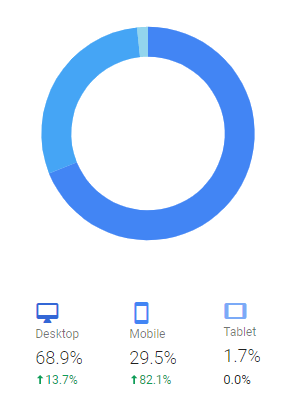
And, of course, this percentage will vary depending on your business and your target audience. You can use Google Analytics to check the devices used to access your website in Google Analytics – just be sure to remove your own and bot data from your results using our blog post on the subject.
For our website we get 68.9% of visitors from desktop, 29.5% from mobile devices and only 1.7% of our visitors come from tablets.
This makes sense because we primarily work with businesses, and most people will use laptops or desktop computers during business hours. So, for us, mobile-first design shouldn’t be our first concern, but of course, we do make sure our website works just as well across all devices and screen sizes, as everyone should.
If your product service is the sort of thing that people would search for outside of business owners, on their mobile phones, then mobile-first design should be a priority for you. Especially as 83% of mobile users say that a seamless experience across all devices is very important.
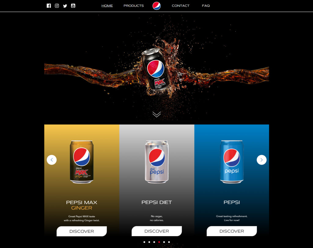
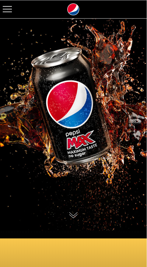
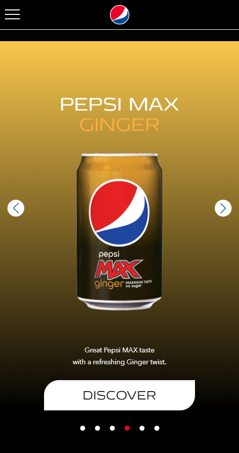
It’s quite difficult to find a visual example of what mobile-first design looks like, as you can never be completely sure without speaking to a designer. Personally, when browsing websites for this blog post I thought that Pepsi’s website has an incredibly seamless transition from Desktop to Mobile. The experience on their website is almost exactly the same on both devices.
8. Accessible design
This refers to design that is accessible to all. It means ensuring that your website is accessible to those that are deaf, colour blind, with a slow internet connection, using a mobile device, visually impaired, blind and more. The Web is now 30 years old, and now people are expecting more websites to be accessible.
In the UK our law dictates that websites belonging to a government body have to be accessible, but around the world laws making this the norm are coming in to place. We could write a whole blog post on this topic but here are some standard ways to make your website more accessible.
- Using colours and hues that will still stand out and contrast to those who are colour blind
- Providing transcripts for audio and video content, for the deaf or those with limited bandwidth
- A website that works with enlarged font, for the visually impaired
- Navigation that can be done through the keyboard, as well as the mouse. This is for those who are physically disabled
Though this isn’t a new concept it has recently gained traction as now more and more businesses are bringing accessibility into the forefront of their design. We’re working hard presently to bring our own website up to these standards, to ensure that everyone can use our website when they visit.
For now, we have started using the plugin WP accessibility, to bridge the gap in the meantime.
Website design trends are always adapting and tend to follow the trends within graphic design. It’s worthwhile keeping up to date to ensure that your website continues to look modern and attractive to your visitors.
So, do you think we’ve got all of the biggest website design trends for 2020 or have we missed out the next big thing? Let us know in the comments!